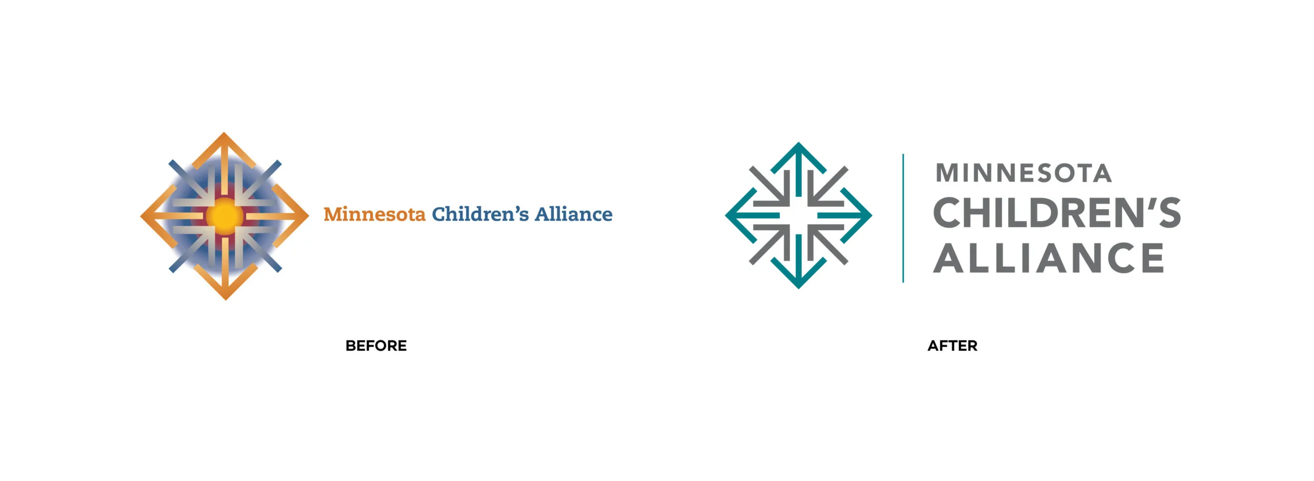
The Logo
The symbol of four arrows pointing inward and four arrows pointing outward was an excellent metaphor for how the Alliance fulfills its mission through the work and collaboration of its employees, members, CACs, policy-makers and partners. The arrows express this outward and inward flow of knowledge, resources, and trainings. The diamond shape created by these arrows creates a complete mark that represents community, wholeness, and inclusiveness.
More than a Logo Refresh
The Minnesota Children's Alliance brand is more than a name or a logo. We created a system of artwork, typography and colors that reflect the spirit of the organization and the work it does. Using it consistently builds recognition, awareness, and trust with constituents.