Logo Meaning
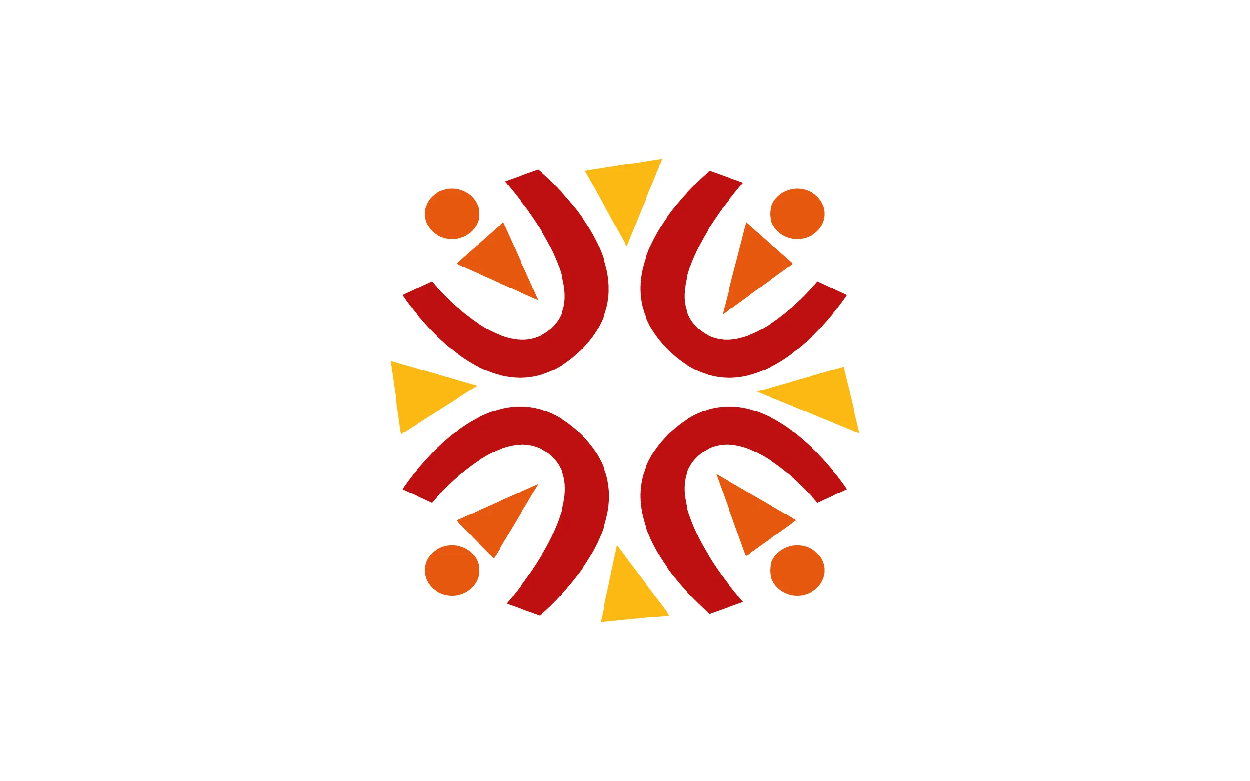
Much like Ascension Catholic Academy, the logo icon is comprised of many parts to form a whole. The orange circle and triangles represent people. Together, these shapes stand for ACA's thriving community of scholars, staff, educators, families, board members, partners and donors. The red U that surrounds each person symbolizes the unity, support, and hope that ACA gives its scholars, while the vibrant yellow triangles reflect the energy, growth and culture of ACA. Together these shapes form a cross, a symbol that illuminates ACA's faith-based mission. Faith is a source of strength for each school, and scholars practice faith and prayer daily. The shapes within these three groups are intentionally imperfect and organic, as if cut from construction paper by a young scholar. Overall, the symbol is bold and playful, embodying the spirit of the people, faith and philosophy of the Academy.

Branding Challenge
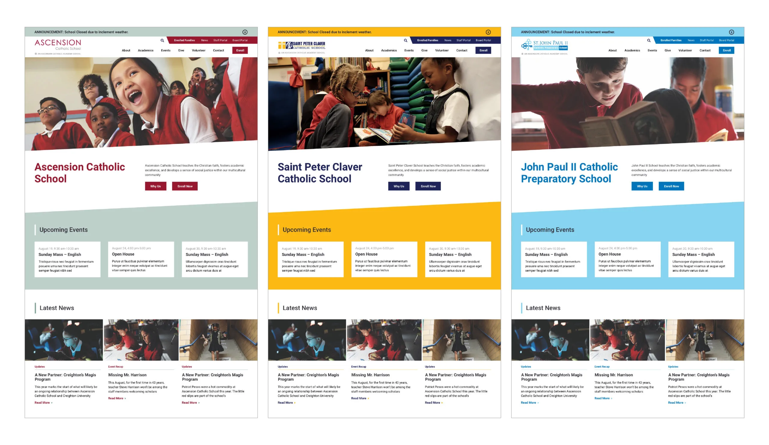
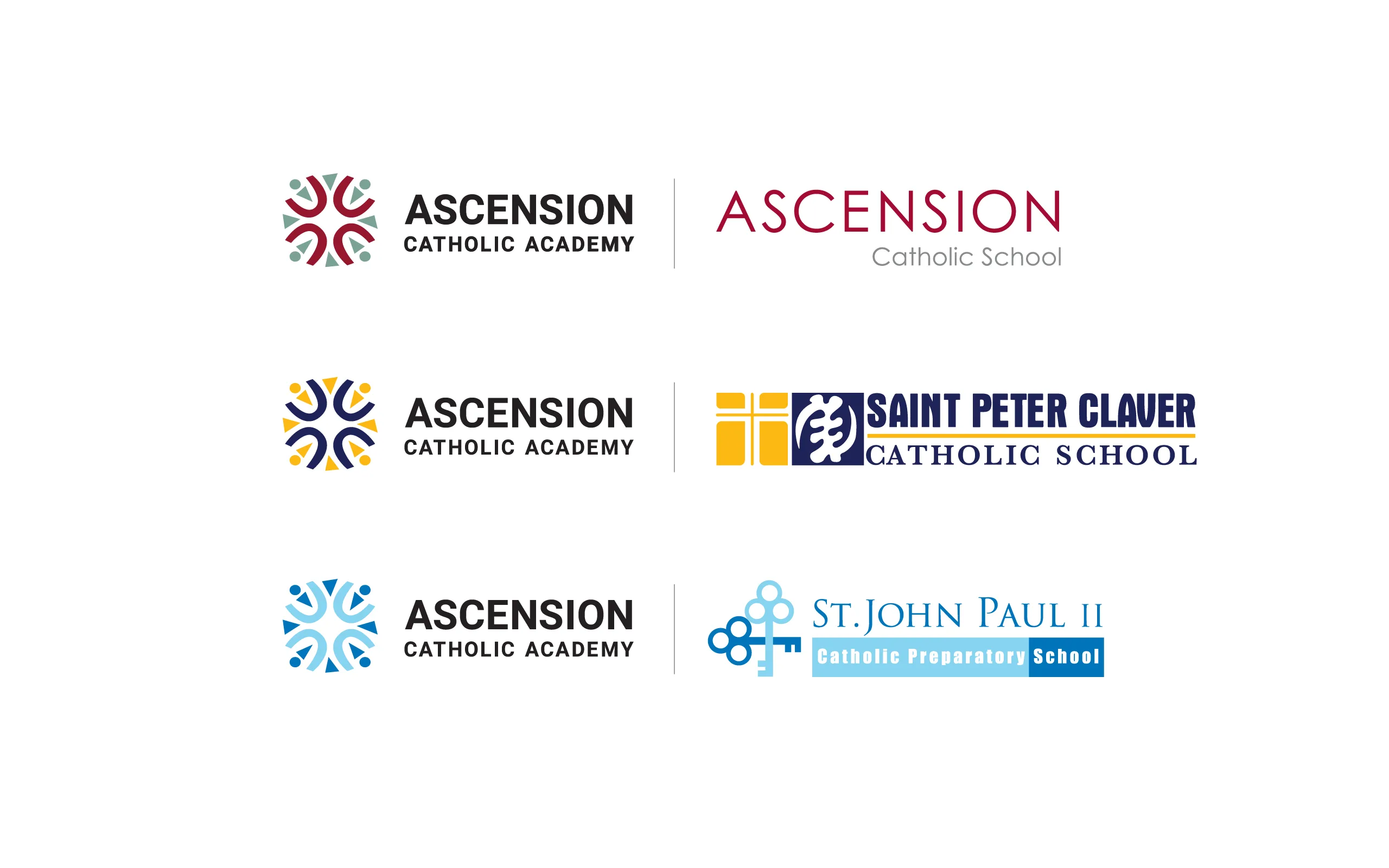
Each school within the Academy has its own identity shaped by its history, families, and neighborhood. We needed to create brand for the Academy that would complement these three unique school identities. The logo needed to be bold and strong enough to stand on its own but adaptable enough to work with each of ACA's school brands. The ACA symbol adapts to match the school's color scheme.
One Project, Five Websites
The project consisted of five websites total. One for the Academy, one for each of its three schools, and one for the Ascension Parish. After finalizing the brand and determining how the brand would work across three sites we created one module user interface. This user interface had five variations in color treatments total so St. John Paul II showed off its school pride with its hues of blue while Saint Peter Claver's design is filled with bold yellow and blue.