Logo Meaning
The logo is a visual interpretation of the Center’s mission, vision, and cutting-edge work. The symbol portion of the logo is known as the “burst.” The burst is an energetic, exciting icon that represents the Center’s research, training, and consultation that inspires, challenges, and motivates practitioners. The burst, more simply put, shows the transformation that occurs in a person’s clinical practices after they have worked with the Center. Furthermore, each shape of the burst is a representation of a person who has grown and changed because of the Center. Practitioners bring new knowledge and inspiration, fostered by the Center, to the workforce and provide transformative care to those affected by mental illness and substance use disorders.
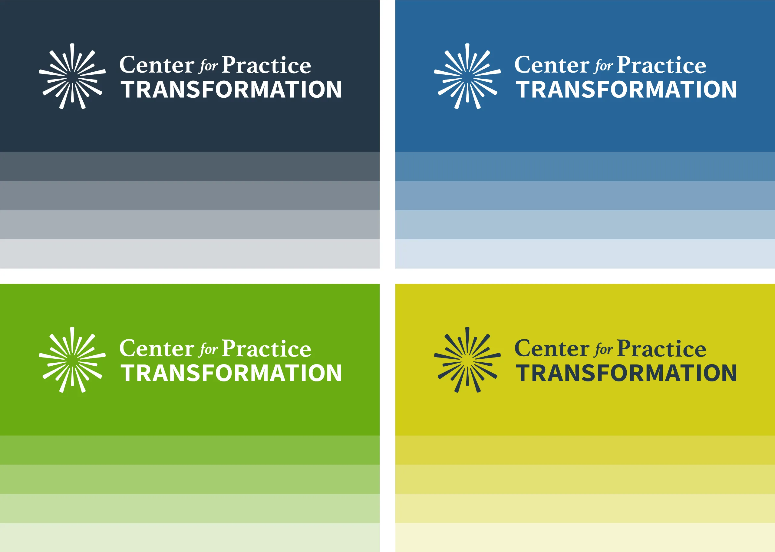
Color Scheme
The color scheme is strong, modern, and vibrant. Green is traditionally associated with renewal, energy, and growth. The bold green and yellow green included in the logo symbolizes how the Center moves clinical practices, research and practitioners forward. Combining these two green hues with a friendly blue creates a harmonious effect, and is intended to reflect the partnerships the Center has formed. Blue is often associated with knowledge, stability and unity. The Center’s work is grounded in sound evidence gathered through research. The deep, dark blue provides stability and is a reflection of the power and importance of the Center’s research. The colors are highly compatible with Web Content Accessibility Guidelines (WCAG) 2.0 compliance meaning the website is more accessible to a wide range of individuals with visual disabilities as well as more readable to users in general.