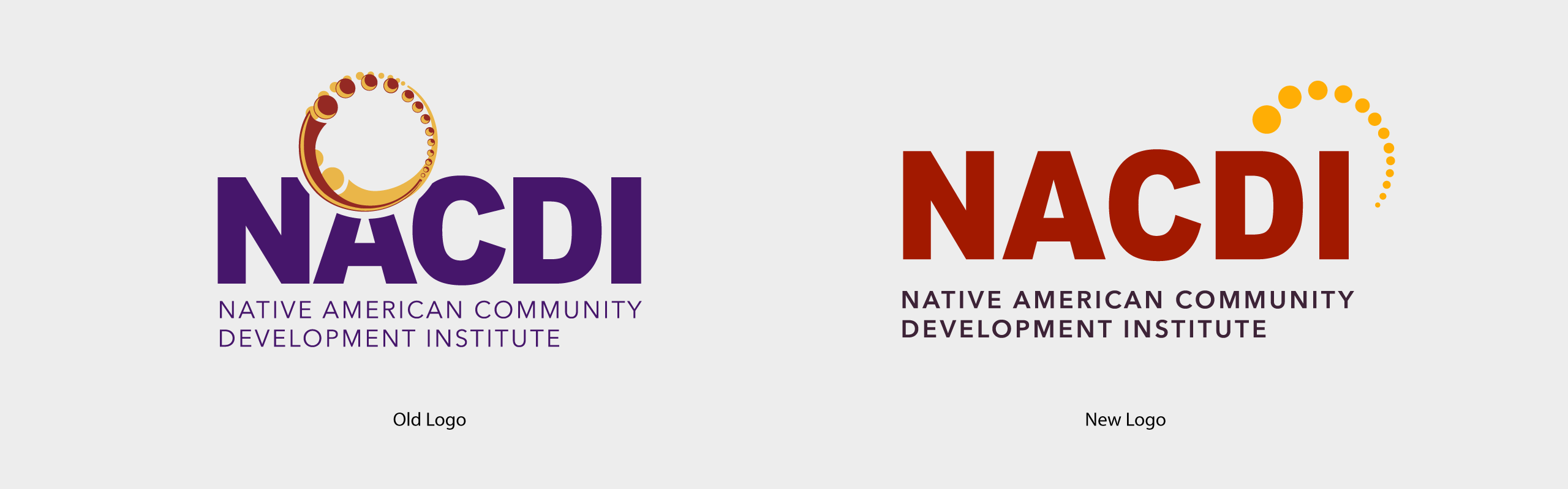
Logo Refresh
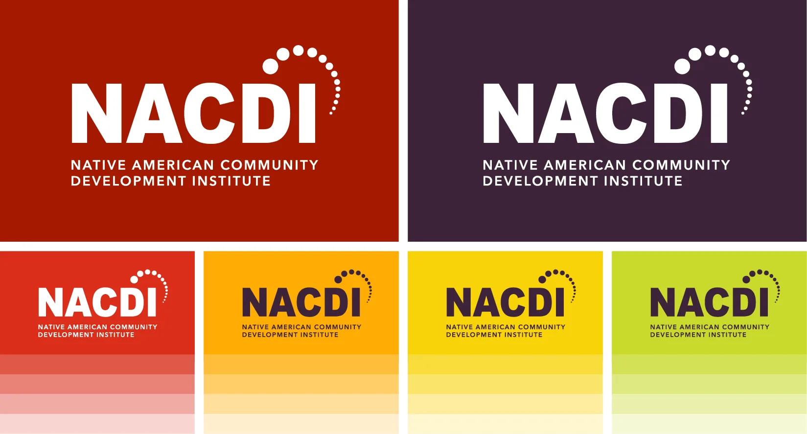
The logo is a visual interpretation of NACDI’s mission, vision, and work. The symbol portion of the logo is known as the “arc.” The symbol is comprised of multiple circles which represents several individuals coming together to form a whole. The movement created by the arc illustrates wholeness, continuous growth, and inclusivity.
The Role of Color
The gold and red hues were inspired by colors found in nature during harvest season. These warm hues are also associated with feelings of joy and overall wellbeing. The dark purple, used for the text “Native American Community Development Institute”, grounds the logo and is a reflection of the strength of NACDI’s community. The colors are highly compatible with Web Content Accessibility Guidelines (WCAG) 2.1 compliance meaning the website is more accessible to a wide range of individuals with visual disabilities as well as more readable to users in general.
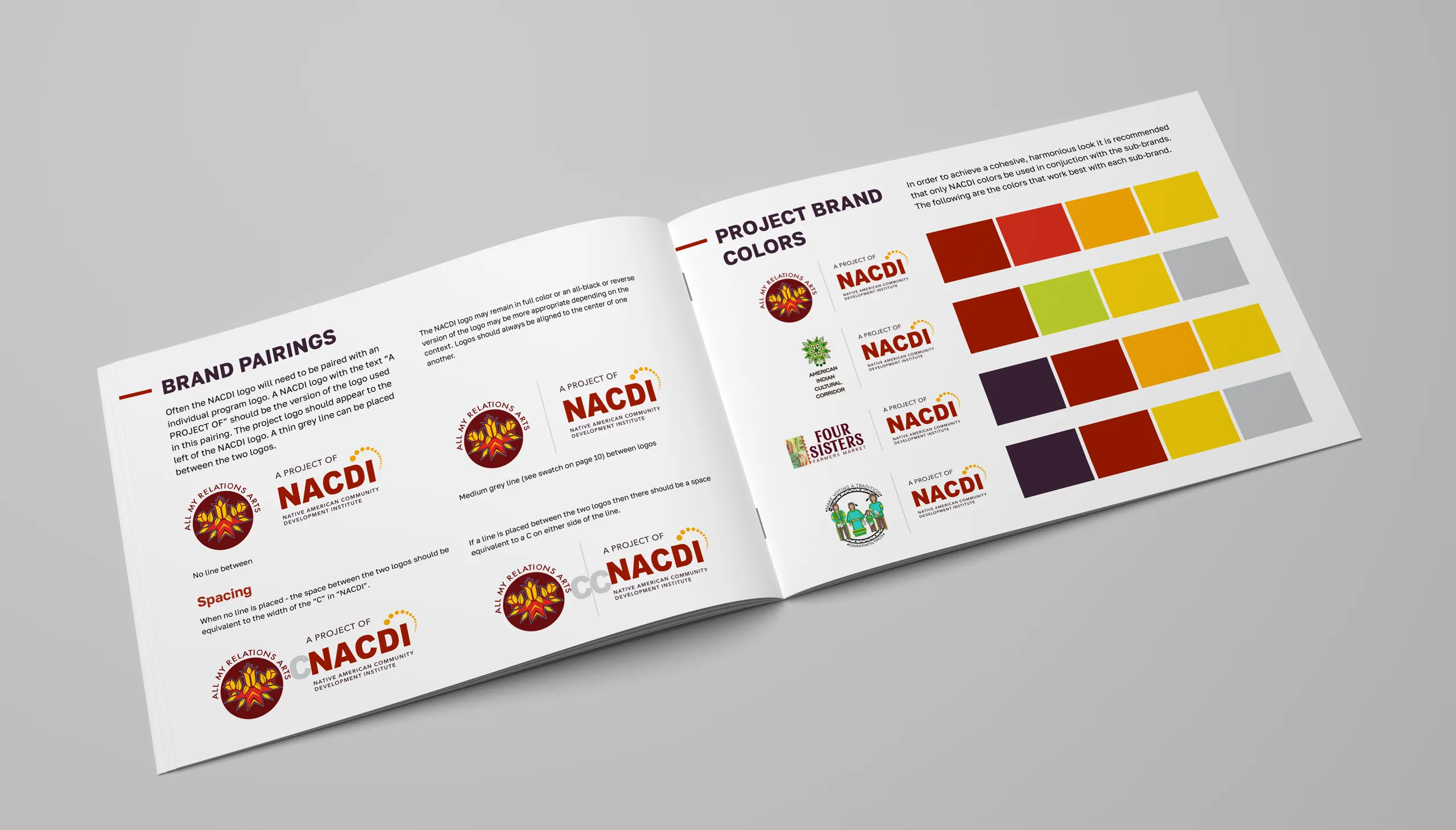
Finding Cohesion with Sub-brands
NACDI is known for four key programs that each have their own distinct brand including: All My Relations Arts, American Indian Cultural Corridor, Four Sisters Farmers Market, and Make Voting a Tradition. One of the goals of the brand refresh was to find cohesion between NACDI's organization brand and these sub-brands. The color scheme was simplified and each sub-brand uses colors from the main brand color scheme and documented in the brand guidelines.