Our design process is much like the websites we create – adaptive. It adapts to an individual client’s needs and budget as well as the advances in browsers, mobile devices, etc. One piece of the process that has been in place since day one but continues to evolve is moodboarding.

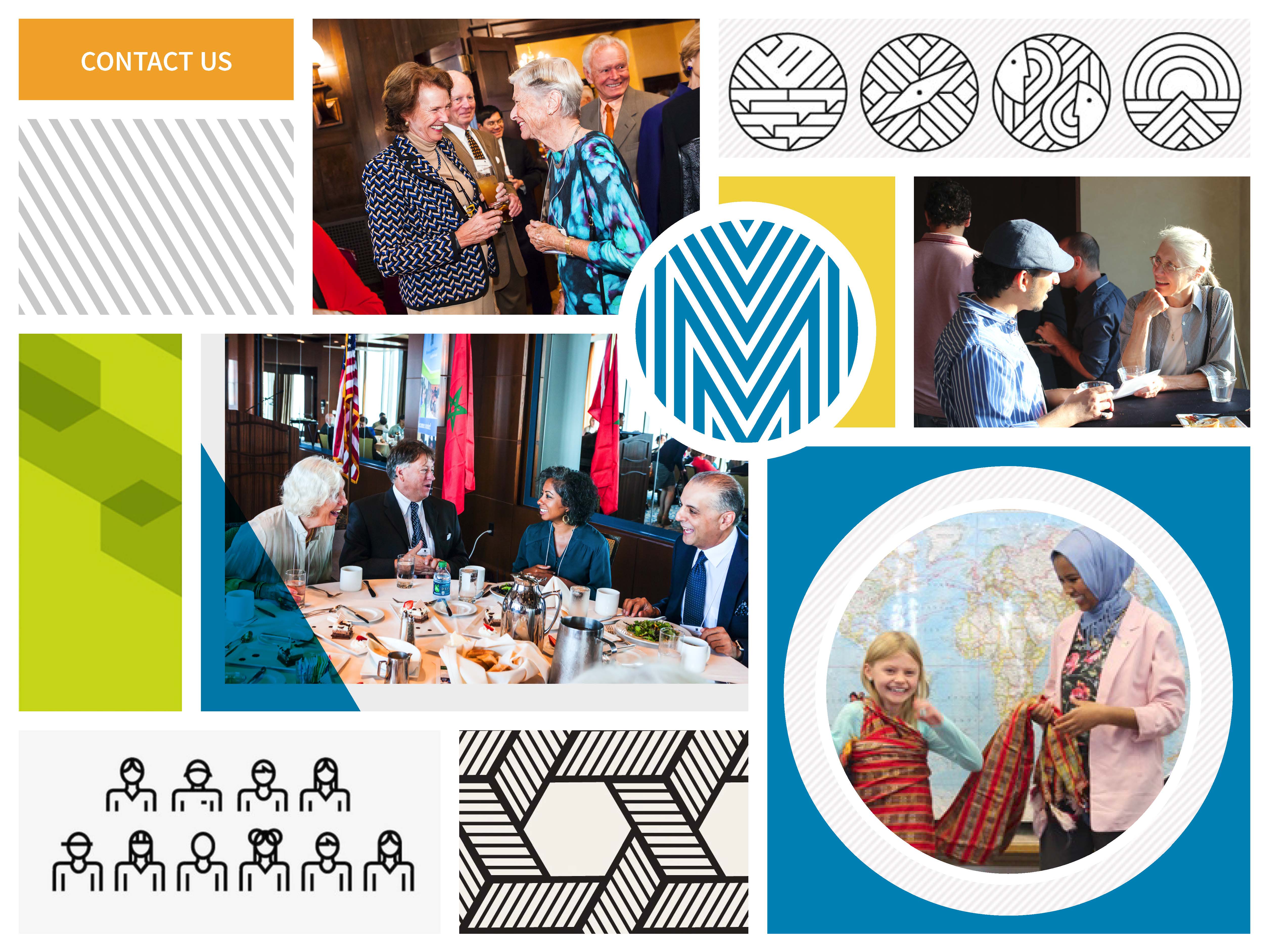
Moodboards are a collection of visual assets that act as rudimentary style guides for the future website design. Moodboards allow us to show our client a proposed look and feel for their user interface without investing too much time in what could be a failed direction. They also help us define, on a high level, the style of the elements that will eventually go into a web style guide including: color palettes, typography, layout, image treatments as well as iconography and illustrative styles. Moodboards communicate the essence of how a brand will be represented. When presented, they are intended to evoke an emotional response or as we call it “a gut reaction.”
Although their core use remains the same, our moodboards have evolved in format and presentation. In the past they showcased specific font families, navigation, fully designed calls to action, etc. that could eventually be included in the final website. We discovered these boards often restricted our designs and sometimes confused our clients. Several of them took the boards very literally seeing them as website layouts instead of a starting point to help direct the site’s look and feel. The point of the exercise was lost which is to choose a board that speaks to your organization and best tells your brand story. Today our moodboards are much more abstract. Let’s take a look at one of moodboards we created for one of our current projects due to launch in March – Global Minnesota, formerly known as Minnesota International Center.